How less can mean much more.
I was demonstrating to the Guild the other evening. We discussed the use of colour. I had brought along together some interesting new approaches gained initially working with Jane Strother some fiendish colour exercises she gave me in one of her excellent online courses. (link here for you). It was in the context of painting painting with acrylics, taking landscape and moving through to abstraction.
Working back through my notebooks I rediscovered these colour ideas. Very simple approaches and very recently time around I worked them through in small 14 x 21 cm studies in oil paint on paper.
| Idea 1 | Ochre | Cadmium Red | Black | White |
| Idea 2 | Ochre | Cadmium Rec | Indigo* Blue | White |
| Idea 3 | Orange | Phthalo Blue | Black | |
| Idea 4 | Burnt Sienna | Cobalt Blue | White | |
| Idea 5 | Cadmium Yellow | Payne’s Grey | ||
| Idea 6 | Lemon Yellow | Pale Grey | Black | |
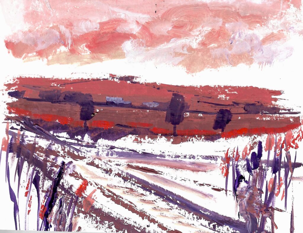
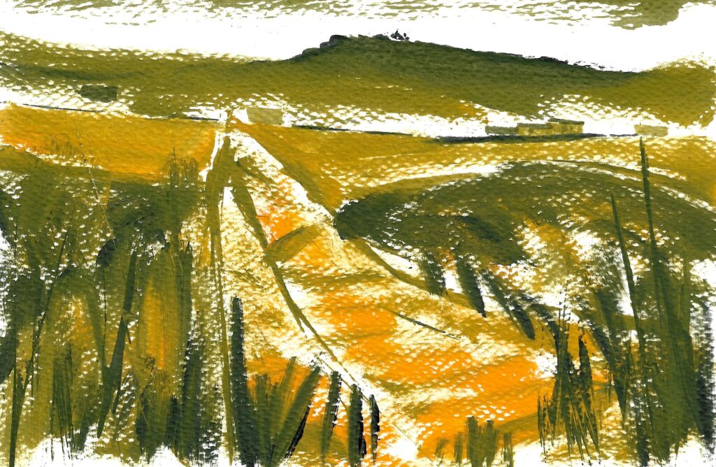
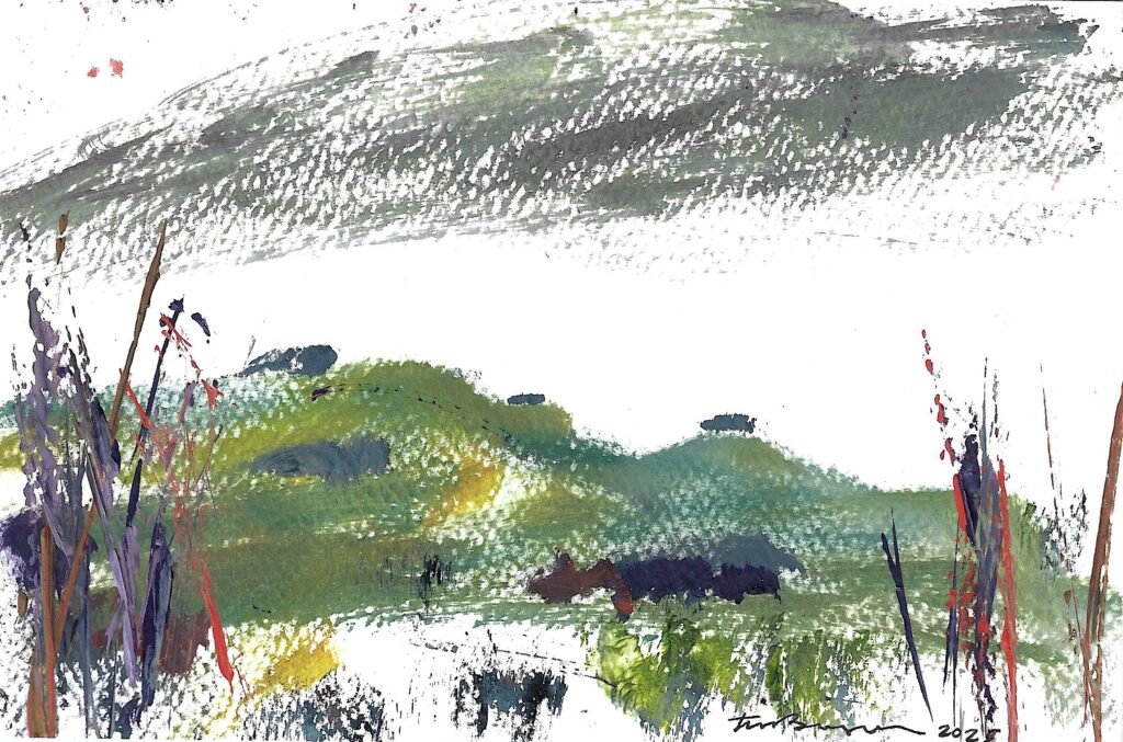
| These exercises can be tried with thick or thin paints, oils or acrylics, using a brush or palette knife and scraping back and the idea was to do one simple landscape study for each | ||||
- I used Phthalo Blue
The results of these exercises, across a week, were invigorating and have enabled me to kickstart larger paintings using these reduced and uncomplicated pallets. Here are the colours listed above. You might work through them.. then you can play tunes on them, like all good music.
HERE ARE THREE RESULTS
Other permutations can be seen on my Blog over at Tim Baynes Art and more on Jane Strother – painter, teacher, mentor and someone who inspires here